Congratulations! You’ve created an amazing article, and you’re excited to share it on your blog.
You’re hoping after people read it, they’ll be compelled to check out your company. Maybe they’ll sign up for a demo. Maybe they’ll take the plunge to the free trial. Or maybe they’ll check out more of your articles and videos to learn more.
Hopefully, they’ll do all of that, but here’s the thing: Internet readers are a lazy bunch.
According to an oft-cited study from Chartbeat, one third of your visitors view your articles for about 15 seconds. Seconds!
There’s tons of advice out there about how to structure your articles for skimming and how to surface the most important info to grab wandering eyes fast…but let’s remember one of the most classic ways to get people to do something while they’re reading.
Let’s talk about calls to action.
These deceptively simple upgrades improve your conversion rate and help your readers take the actions you want them to take – win-win, we’d say.
What is a CTA?
A call to action, or CTA, at its most basic is just that: A compelling reason for your viewer to take an action.
These cues have been around since as long as humans have been trying to convince each other to do things.
More formally, they’ve always been a fixture of sales. Think of snake oil salesmen asking people to “Step right up!” or old mail order catalogs with “Call Us” telephone numbers.
Every time you’re exhorted to do something while reading, viewing, or listening, you’re experiencing a CTA.
The trick is figuring out what types of CTAs work for your products – and what your sales-weary audience hasn’t already seen a million times and learned to tune out.
Spend Time on Your CTA Strategy
CTAs can feel like an afterthought, sprinkled throughout your articles and content assets after the hard work of creating them is done. Flipping the script on your CTAs, though, can help you make sure all your content accomplishes your goals.
CTA strategy ties directly into your content strategy. Consider this: Your content strategy lays out the why of content – what are you trying to accomplish and how will content help you get there?
Calls to action throughout all of your content helps tie them right back to those goals. Creating a long-form blog post? Great…why? What action do you want them to take as a result?
Be deliberate about how you use CTAs within your content, and think about it well before you ever put fingers to keyboard or start recording.
1. What’s your goal? How does it relate to your content strategy?
The form your CTAs take should help you accomplish your goals. You can use CTAs to urge visitors into all kinds of actions – so what makes sense for your content goals?
You can use CTAs for:
- Lead generation (free trials, content upgrades, offers)
- Sharing to a social platform
- Lead nurture (free trials)
- Conversion to customers (sales)
- Event promotion or registration
- And almost any other content marketing goal
2. Consider your channel
People interact with your content in different ways.
Someone who opens your website on a mobile device one-handed should be just as able to engage with your CTA as someone who’s on a retina-display desktop computer.
People who are reading your content in an email will be in an entirely different mindset than someone browsing your social feed. Tailoring your CTAs to the right channels is a must.
- Email CTAs. Text-based CTAs work best here, since some email providers will format fancy buttons oddly. Plus, in-text links feel less stuffy and more personal.
- Web-based CTAs. You can go a ton of different ways here, and there’s no right or wrong answers. When installing CTAs on your website, you’ll want to think about your visitors’ natural flow (you can use heatmap technology to see where their eyes go too), and test often.
- In-App CTAs. Take user experience (UX) into account here, especially if people will be exclusively on mobile when using your app. Don’t interrupt the experience with an enormous pop up that’s hard to get rid of – that’s especially galling on a small screen. Think instead about making the process easy by using natural mobile gestures like swipes or double-taps.
- Blog CTAs. Unbounce reports more than 90% of visitors who read your headline will also read your CTA copy. Take advantage of that behavioral opportunity with well-designed, conceptualized, and well-written CTAs.
- Video CTAs. KISSmetrics added a CTA inside a video and saw more than 380% jump in clicks over using just a CTA in a sidebar, according to this QuickSprout write-up.
- Social CTAs. Adding CTAs to your company Facebook page can result in almost 285% in click-through rate increase, according to AdRoll.
3. Use more than one CTA per content piece
Audience Ops blog posts contain three or four different CTAs, two promoting the same content upgrade.
We do this for a few reasons:
You get to tailor your CTA.
Account for information your visitor has already processed up to that point.
You could use a few different types of CTAs.
CTAs can be text-only, include an button, include an image, or some combination of those things.
You cover more areas of the post.
We position our CTAs at about one-third and two-thirds of the way through the article, and at the end.
Remember the stat about most people not even scrolling? This way, you increase your chances of catching someone who might be interested in the CTA, but wasn’t planning to scroll down.
This is what that distribution looks like:

Source: Chartbeat
For instance, on our recent post on customer success, we used these two CTAs positioned at about one-third and two-thirds of the way through the post.
This one was positioned just after the intro. It assumes the reader hasn’t read most of the piece and is looking for a place to start:

This one is just before the conclusion and assumes the reader at least skimmed on the way down, but might be looking for more information:

At the end, we positioned a friendly text-based CTA encouraging people to get a free consultation if this is the type of content they want their own readers to consume:

And at the very end, for the intrepid readers who’ve come on the entire blog post journey with us, we promote our content marketing course for founders:

4. Give people multiple ways to engage with your CTAs
We talked about having different types of CTAs and different messages – it’s important to give people multiple ways to engage with your encouragement. Not everyone will even see all your CTAs.
Studying heat maps and human psychology can give us some insights into how to position, colorize, box, and animate (or not) our CTAs, but covering your bases can help too.
Try:
- Using a button in a contrasting color
- Including text-only links even if you already have a button or an image-based CTA
- Experimenting with slide-ins or welcome mats like the one below:

A welcome mat appears at the top of a page above the content – this very meta welcome mat from SumoMe promotes their “Welcome Mat” product.
Every customer-facing element where they have the opportunity to continue moving through the funnel should have some kind of CTA.
We’re not talking about loud buttons or banners everywhere, since that would be overkill. But if the person could take an action, everything about your property should be organized to encourage it.
How to Create Content Marketing CTAs that Convert
After examining dozens of CTAs, Kathryn Aragon for Crazy Egg found that most CTAs had three major components:
- Offering something in order to reduce risk – giving the prospect more confidence toward the buying decision, focused on the benefits of trying it out.
- Explaining what the next steps are. Should the prospect click? Enter their email? Share?
- Encouragement to act quickly, some feeling of a limited timeframe to respond, or an otherwise compelling reason to do as you ask.
1. Focus on benefits and confidence-inspiring offers
Your visitors are often wondering, “What’s in it for me?” if they do what you’re urging them to do via your CTA.
At such a transactional moment – you’re offering something of value and they’re considering whether they want to take an action that might feel momentous – you need to make sure you’re delivering something worthwhile.
Is your content upgrade or freemium trial or demo worth the customer doing as you ask and downloading/subscribing/requesting an appointment?
If you wouldn’t do it, why would your customer?
Beyond providing value, addressing people’s fear of commitment can go a long way. You’ll see lots of language like “no credit card required,” “no loopholes,” or “no commitment” in successful CTAs.
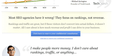
Joanna Wiebe at Copyblogger wrote about testing some language around a CTA button for Friendbuy.com – one with no reassuring copy near the button, one with some social proof in the form of a testimonial right next to the button, and the third below:

This version, with its reassuring promises of no credit card needed and the ability to customize everything, won the experiment by a whopping 34%.
2. Remove barriers to conversion
In other words, “make it easy for people to do the thing you want them to do.”
Offering a clear path to victory – and explaining said path in easy-to-understand language – increases the chance your visitors will do what you want.
Remember how Internet readers don’t want to do a ton of work to get the goods? They’re already planning to give you their email address in exchange for something – make sure the rest of it is as easy as you can make it.
Use clear language without any element of burden.
Even instructions to “type your email into the box” or “click here and then enter your email to download” may seem like a lot of work. Breezier language like, “check out” or “download” or “subscribe to get” cuts to the chase and makes it seem like less work.
Deliver the goods fast.
You should also set up your website mechanics to seamlessly deliver whatever it is the reader has requested, and quickly. Whether that’s a near-instantaneous email with a lead magnet or a swift follow-up from a sales rep for a demo, this is not a place to have any lags in your process.
3. Measure, measure, and measure again
Remember when you set your goals and objectives for your CTAs related to your content strategy? It’s a good idea to revisit them from time to time with a measurement eye, to make sure you’re meeting your goals and that CTAs aren’t causing leaks in your funnel.
Beware the temptation to benchmark your numbers against competitors or other companies, though. “What works” and best practices won’t always hold true across the board.
For instance, conventional wisdom holds that images and other ways of drawing the eye should improve CTA performance. When HubSpot tested their own, however, they found that simple anchor text CTAs converted 121% more.
Your blog isn’t everyone else’s, so measuring and experimenting based on findings will help you figure out what works for you.
Be sure you’re benchmarking against your own performance to see what’s working and where you’re improving. Read about what others do for inspiration, but avoid basing your own strategy on others’ actions.
4. Keep your CTAs adaptable
With measurement in mind, you should always be testing.
You can test anything from copy to buttons to positioning and beyond. Here are a few examples from QuickSprout of CTA tests others ran:
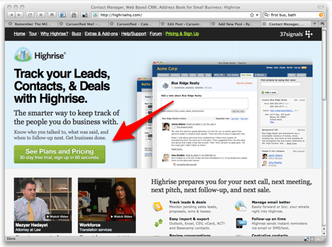
At Crazy Egg, the company tested button copy that 37 Signals’ reported to increase their own conversion rate more than 200% – for Crazy Egg it decreased theirs 10%.
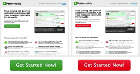
At Performable, just switching their button color from green to red improved their conversion rate by 21%:
Digital influencer (and author of the QuickSprout article) Neil Patel tested out a couple locations for his CTA button. When it was placed above the fold, it performed more poorly than one placed right below the fold:
Takeaway? The internet changes fast. Consumer habits change fast. What works for you today might not tomorrow.
For example, Google announced recently that it will start punishing intrusive interstitial pop-ups starting in January 2017. Since these definitely fail to meet the standard of “helpful and not distracting,” you should get rid of them.
And remember how pop-ups were all the rage for a while before people got accustomed to them and then angry with how disruptive they became? These are the kinds of tech and behavioral changes that can throw off your CTA strategy if you’re not aware.
Staying flexible and ready to adapt based on continuous testing will set you apart.
Using a plugin or other technological helper that can insert shortcodes into your pages can help you do that. It’s much easier to swap out CTAs for different lead magnets or products instead of doing it all manually post-by-post.
Getting Started with Better Content Marketing CTAs
If you’re not already using content marketing CTAs in your work, take a moment to figure out what you’d like your audience to do when they interact with your content. Meld that together with your existing strategy.
If you are using CTAs often and well, it could still be time for a review. Countless experiments from well-respected companies prove that even the smallest tweak like a color or a word here and there can affect conversion rates by significant percentages.
Imagine if you improved your conversion rate just 2 percent across the board with simple changes! That could be revenue you can stop leaving on the table.
CTAs are simple but powerful, and spending the time to fine-tune yours can yield immediate effects on your content marketing ROI.
Didn’t think we’d end this article without our own CTA, did you? If you’re interested in having posts as thorough and topical as this one on your blog, let’s set up a time to talk. No obligation – just a chat about what life might look like if posts like this were done for you every week.