You could have the best content in the world, but if your blog is designed poorly, you could be doing damage to your business.
That statement might seem a little extreme, but it isn’t. It’s the truth. The design of your business blog could actually be turning off your readers.
Think about it this way.
You go to a five star restaurant, and receive the best meal of your life that’s perfectly plated on high class dish-ware. Now, take that same meal and serve it up in a to go box that’s falling apart. It isn’t going to have the same effect. A clear, clean, and focused design will help to accelerate the results you can get from your blog.
Even with the best content in your niche, you won’t see the conversion rates you deserve if the design of the blog is lackluster. Luckily, we’re going to show you the exact elements every business blog needs to include.
Below we dive into seven different elements every business blog must include if you want to provide a stellar reading experience, while converting readers into customers at a very high rate.
Let’s jump in!
1. Enticing Post Previews
Your blog is so much more than just a blog. You need to look at your blog from the eyes of a publishing professional or a magazine editor. If you flip through a magazine, or go to one of your favorite news websites you’ll notice that the headlines and post previews work together to get you excited about the content.
You can easily peruse the table of content or the homepage of the blog until you find exactly what you’re looking for. A lot of business owners simply have all of their full-length posts on display, which makes the user endlessly scroll to find what they’re looking for.
Some blogs have post previews, but they’re nothing more than the intro paragraph. Instead you should have your posts listed in a magazine style format, which includes a compelling image, your headline, and a post description that gives the reader an idea of what your post is about, while enticing them to read more.
2. A Super Compelling CTA in Every Blog
Your call-to-action has a direct correlation to your bottom-line as a business owner. Your CTA should direct readers to join your email list or even purchase one of your products. You need to place a compelling CTA within every single one of your blog posts.
We know this isn’t directly related to the design or layout of your blog, but it’s incredibly important. Without a call-to-action you’re leaving your readers hanging and you aren’t doing your business any favors. You should test their location, their appearance, and the words you use.
But, you can’t test them until you start including them. So start here. In order to successfully generate leads for your blog, you need to encourage your readers to take a specific action.
3. Seamlessly Matches Your Existing Design
Your blog should be a part of your existing website. Even if your blog exists on a subdomain, such as, “blog.companyname.com”, it still needs to have a direct correlation to your website and business.
Your blog isn’t an island. Think of it as a branch on the tree that is your business. It needs to connect back to your core services and other offerings.
The best way to do this is by linking back to other popular pages on your website, your services and products.
However, the design of your blog also needs to match the core of your business. It needs to use the same color scheme as the rest of your site and a similar design template. Your user should be able to move back and forth between your blog posts, your home page, your storefront, and your about page without feeling like they’ve departed and gone to a different website.
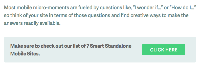
4. Beautiful Subscriber Box Integration
Your subscriber boxes are one of the key aspects of transforming your blog from walls of text, into an integral aspect of your lead generation campaign. Your subscriber boxes should stand out from your blog posts, but still integrate with your existing design.
They need to divert your user’s attention, but not be so distracting that they can’t focus on the rest of your content. Take a look at the example below, which we use on our website:
Beyond subscriber boxes you can even implement pop-ups which display after your user has spent a certain amount of time on your website. But be careful, you don’t want to annoy your readers by bombarding them at every turn.
One way around “annoying” your readers is to provide them with additional value by entering their email address. You can do this by offering them a free course they can’t get anywhere else, or by including a content upgrade that further extends the usefulness of your blog post.
5. Provides a Stellar Reading Experience
When a visitor lands on your blog what’s their immediate reaction? If it’s not a deep breath, then you’re doing something wrong.
The goal of your blog should be to provide a stellar reading experience. Face it, the web is a crazy, loud, and distracting place. Don’t add to the noise with your own blog. Instead, your goal should be to provide a oasis for your reader.
Can your user spend extensive time comfortably reading your blog? The key word here is comfort.
A lot of company blogs look like they haven’t been updated since 1999. Does your blog make any of these mistakes?
- Having flashing banners, ads, and graphics
- Using small fonts
- Using clashing colors that lead to eye fatigue
- Not including white space to let the text breathe
Your blog needs to provide a pleasant reading experience. This means you’ll want to provide plenty of white space, minimize distraction wherever possible, and use large and readable fonts.
Medium does a great job at providing a stellar reading experience with large fonts, tons of white space, and zero things to distract you from the digital page. What design elements can you adopt for your own blog?
6. Clean and Uncluttered Sidebar
It’s easy for your sidebar to become cluttered and filled with any leftover junk you couldn’t fit anywhere else. However, your sidebar needs to be purposeful and only include elements that improve the reading experience.
Instead of filling your sidebar with endless widgets, ads, and other distracting elements try to pare down your sidebar to only the essentials that actually support your business.
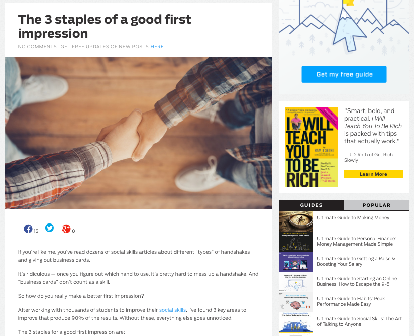
Ramit Sethi does an incredible job of packing a lot of useful information into the sidebar, while still providing a great reader experience.
For instance, if you’re blogging to grow your email list then make sure you include a well-designed subscriber box, and that’s it! Or, if you want to direct your users to more useful content, then include a list of your best blog posts and other valuable resources.
When going through your current sidebar ask yourself the following: what’s the purpose of this element? Does it improve the user experience and result in more leads? Or, does it just take up space?
7. Write From Their Point of View
This last point has a little less to do with design and more about the actual meat of your blog. The content.
Is your blog entirely focused on your products and their features? Or, are you solving your reader’s problems and addressing their most common questions?
In order to have a blog that supports your business you need to be serving your readers. Your blog is an incredible way to add value to your readers and position yourself as an authority.
For instance, the blog for the website HomeGoods, focuses on interior design tips, even though, they actually sell home goods. They don’t talk about their actual products, instead they showcase cool ways you can improve your home.
Connect and speak to your readers deep needs and you’ll find them lining up to work with you.
By implementing a few of the design tips above you’ll create an incredible experience for your reader all while growing your blog’s lead generation abilities.